
Accessibility features for iPhone and iPad.
Photo World Clock supports Dark Interface, Reduced Motion, Sufficient Contrast, and Differentiate Without Color Alone when checking world times, comparing locations, and viewing photos.
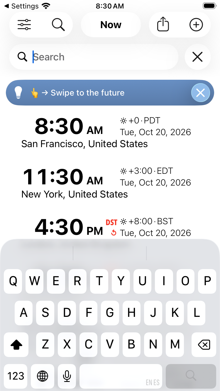
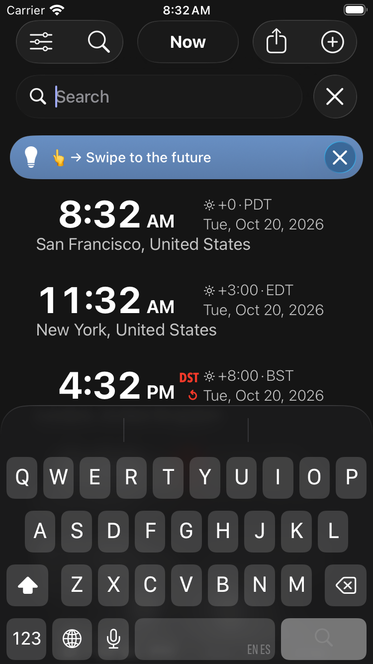
Dark Interface
Choose a dark appearance for dark screens, menus, and controls. Your photos retain their own colors and brightness.
For a consistently dark map, also select Dark in your device’s Settings → Display & Brightness. Maps follow the device’s current appearance when the app uses Automatic or a dark theme. Choosing Light in the app keeps maps light.
Reduced Motion
Turn on Settings → Accessibility → Motion → Reduce Motion on your iPhone or iPad. Photo World Clock reduces custom movement during photo navigation, zooming, and panel transitions.
To stop photos from advancing automatically, open the app’s Settings → Photos and set Slide time to Off. Choose a still photo if you prefer a display without animated photo content.
Sufficient Contrast
Use the app’s Light or Dark Blue appearance for the recommended contrast setup. For clearer text and controls, enable Bold Text, Increase Contrast, and Reduce Transparency in Settings → Accessibility → Display & Text Size.
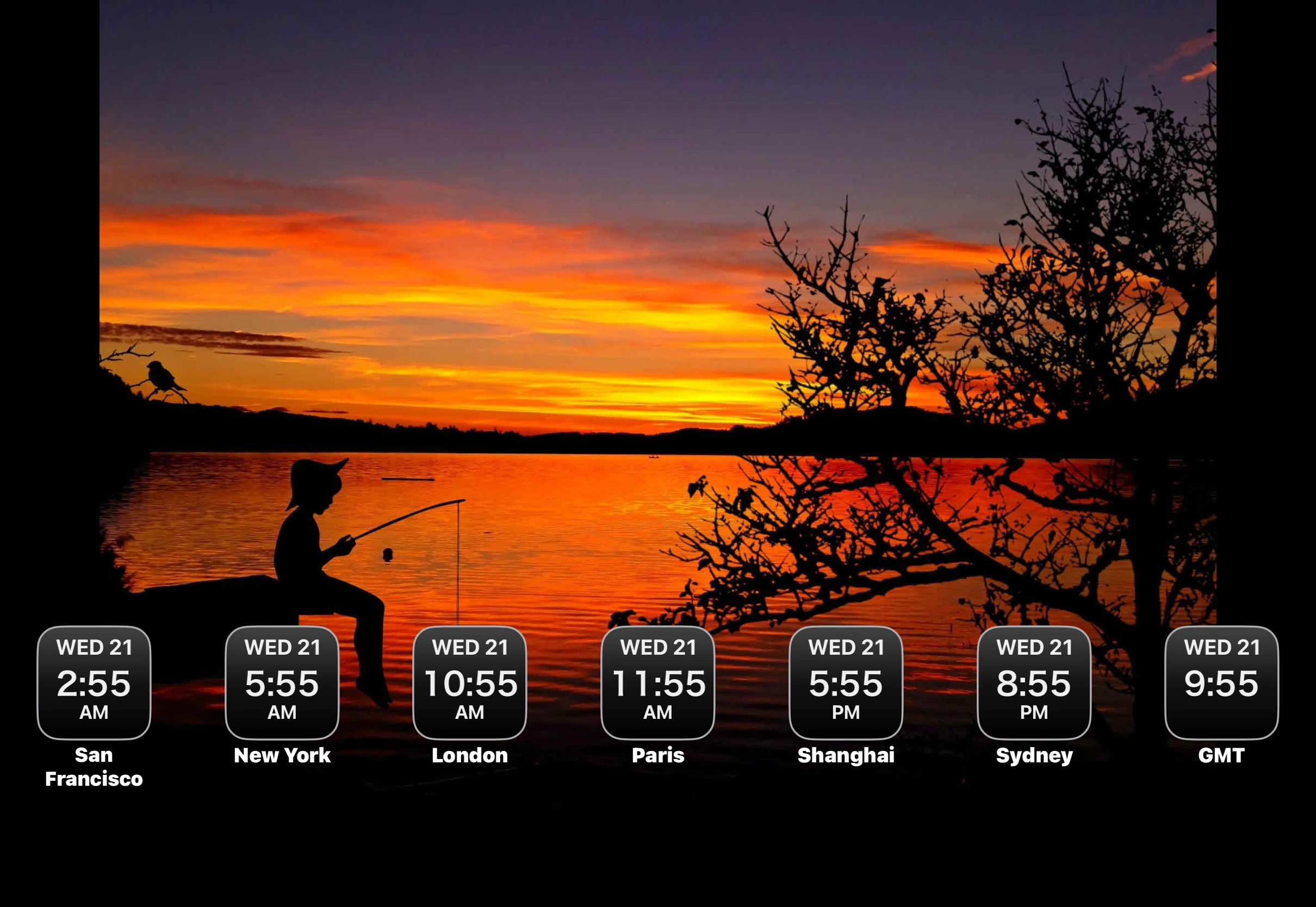
Clock labels use contrasting text and outlines to help them stand out over photos. If a particular photo is difficult to read behind the clocks, choose a simpler image.
Differentiate Without Color Alone
Times, dates, and time differences are displayed as text. Symbols and other visual cues also distinguish day and night and time-navigation states, so important information does not depend on color alone.
Other accessibility needs
We do not yet offer full support for VoiceOver, Voice Control, or Larger Text.
Accessibility support
Need help with accessibility? Contact support, or open the app’s Settings and choose Feedback / Support. Tell us which task was difficult, your app version, your device, and the accessibility settings you use.
Last update: 2026-10-21